WWDC20: Wow.
By PJ Shaw | June 22nd, 2020
Apple just made the iPhone an Android, the iPad a Mac, and the Mac an iPad--from 2012? Well, not exactly, but it’s close enough. There's a lot to unpack from WWDC, including the latest and greatest in iOS, iPadOS, watchOS, and macOS (I left tvOS out for a reason, I didn't just forget about it), and the latest and not-so-greatest in icon design. Yeah.
iOS 14
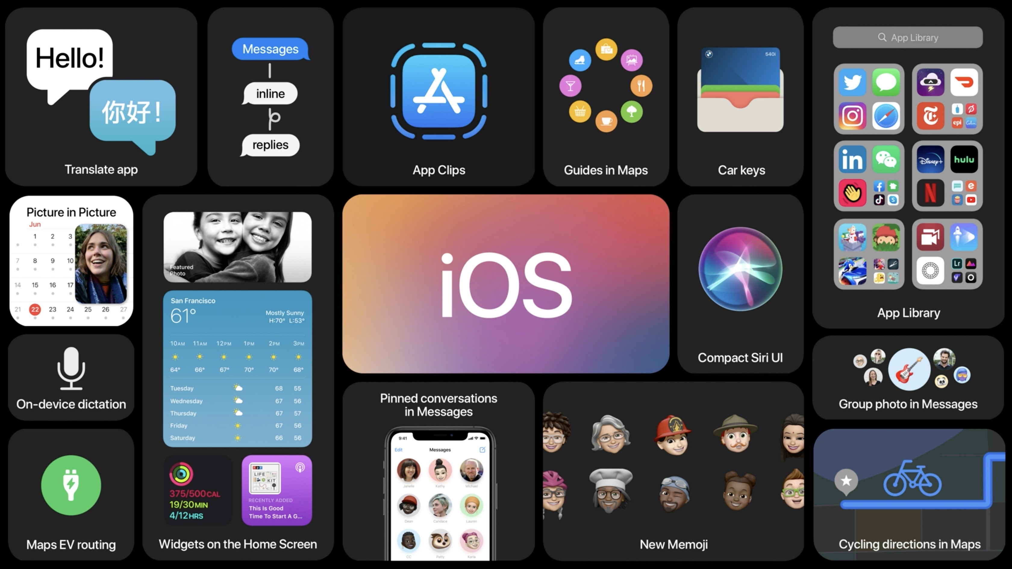
The clear winner of WWDC is iOS 14. With redesigned widgets that can be put right on the home screen (by simply putting it into, in the words of Craig Federighi, “jiggle mode”), an app drawer with some questionable suggestions features (called the app library), and support for (some) third-party default apps, Apple might be doing Android better than Google. And as an Android user, I’m jealous. Beyond that, the Messages app got an upgrade, adding the ability to pin conversations to the top of the app, respond directly to people in group chats (like we see in many other messaging apps like WhatsApp and Telegram), and other upgrades to the group chat experience. Siri got a nice overhaul in both UI and capability, now appearing as just an orb at the bottom of the screen when summoned. Results and responses can now appear as notifications instead of filling the entire screen. Speaking of not filling the entire screen, incoming calls will now appear as alerts at the top of the screen, a very long-awaited feature. This was weirdly announced as an iPadOS feature with only a quick mention of it also coming to iPhone. It seems like a more relevant announcement for iOS, but I guess they were just trying to fill in the short announcement of...
iPadOS
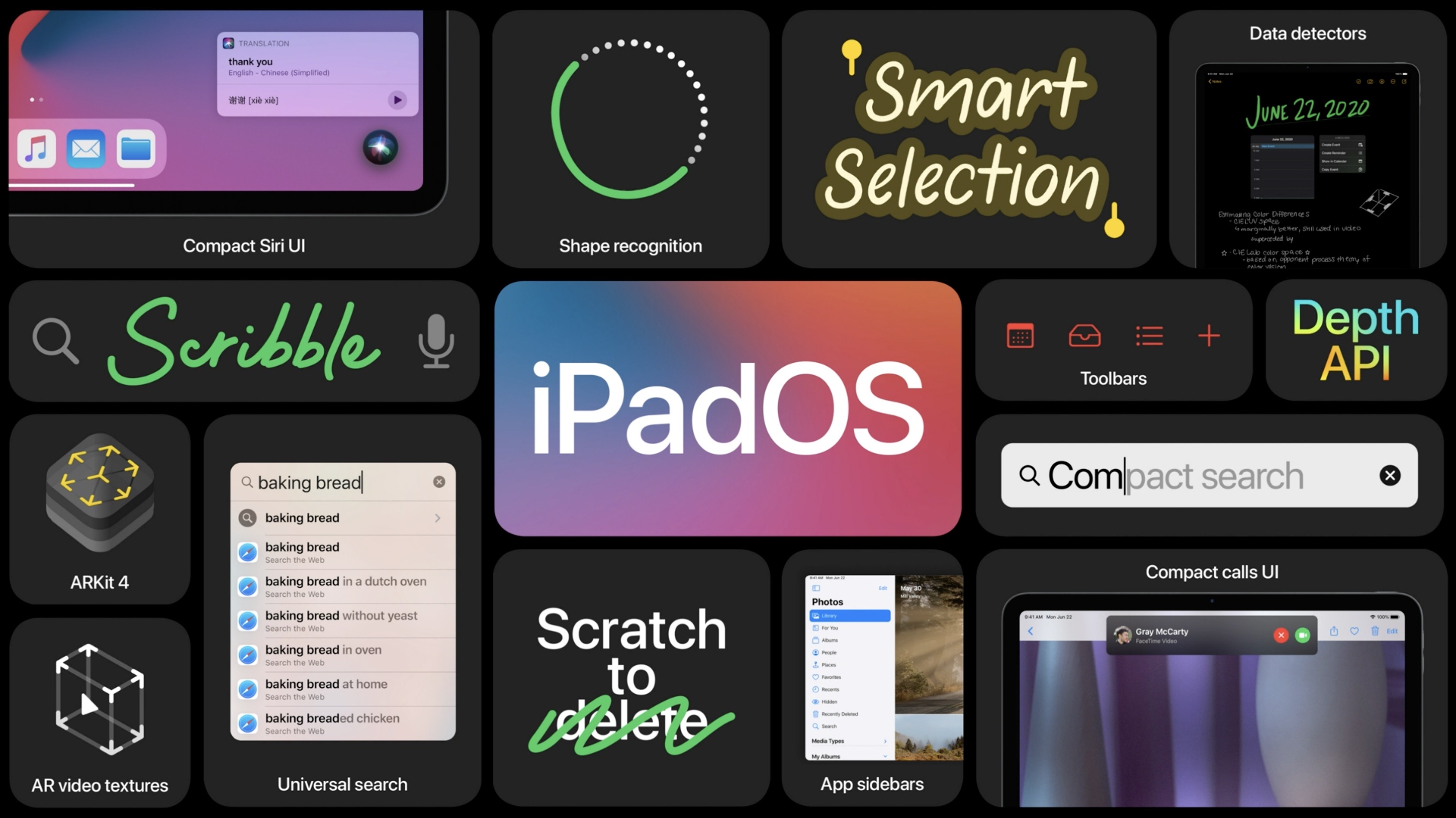
The iPad got kind of neglected this year. Nothing bad came out of the latest version, but not much came out of it at all. It got the new Apple Pencil scribble feature, allowing you to copy and paste or “type” with handwriting, which while very impressive from a handwriting recognition standpoint (it works really well), I know I won’t use it much after trying it a couple of times to bring you this assessment. The updated spotlight search is nice, and it too follows the new trend of not using the whole screen unnecessarily. It also obtains a striking resemblance to it’s macOS counterpart.
watchOS
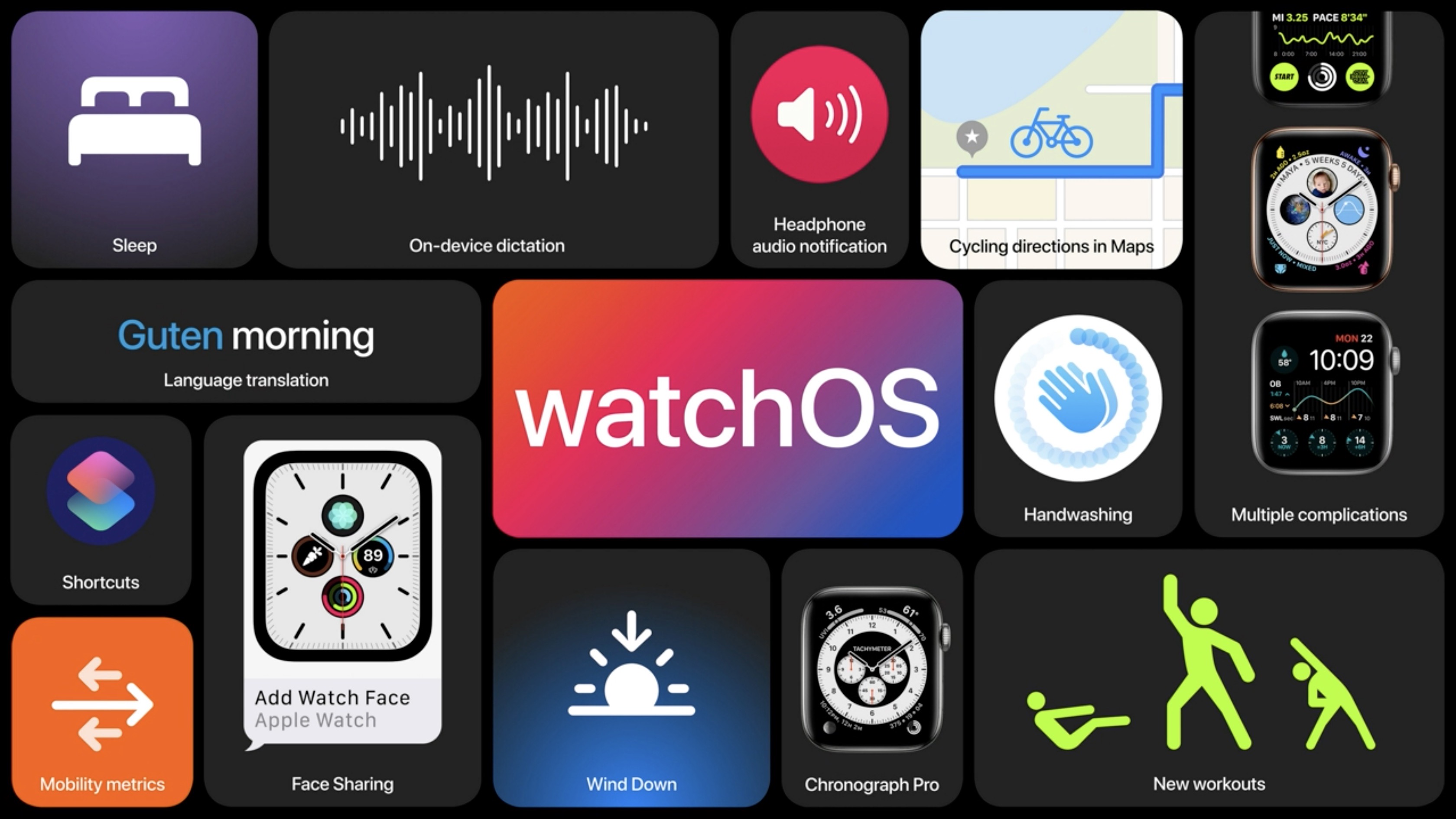
Sleep tracking, dance workouts with a great demo, and some other stuff that nobody really cares about.
tvOS
I think I turned my head away from the live stream for this announcement and by the time I looked back, it was over.
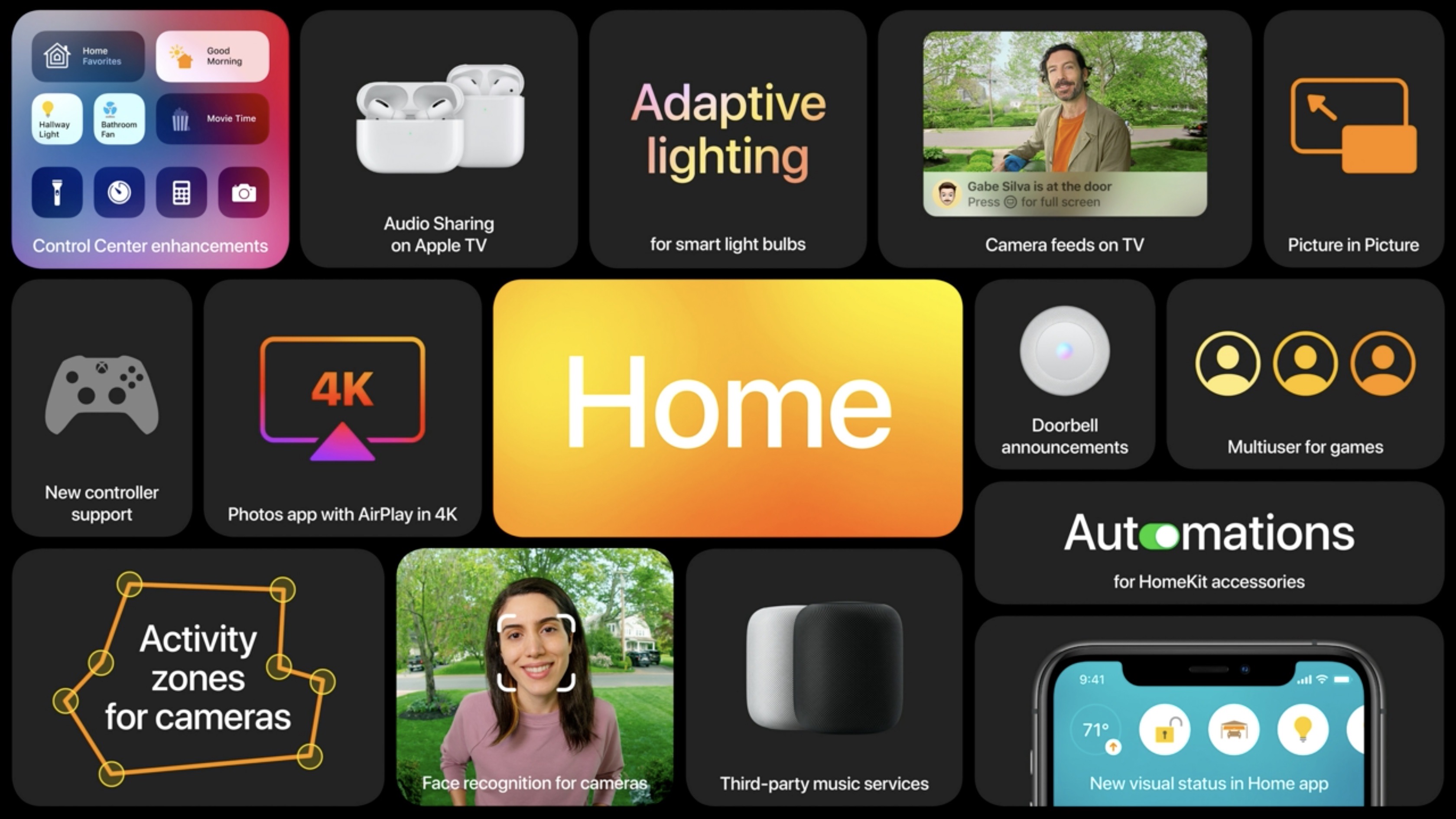
macOS Big Sur
Oh boy. One big theme of this update seems to be, “who thought this would be a good idea?” starting with the name. I mean, come on. I have mixed feelings about this update, so much so that I’m not sure if I ever want to install this update, let alone the beta. Never install a macOS beta. Bad idea. I’ve tried it. Too many times. Bad idea. Anyway, I’ll start with the good. Some of the UI changes to this update are quite nice. The rounded corners of app windows and other UI elements give the interface a whole new look (for better or for worse), the control center is a useful addition, the iOS 14-style widgets bring back a dashboard-like feature, and Safari (my personal browser of choice, don’t @ me) got a big upgrade in speed, design, and privacy. Those rounded corners were dangerous though, and they gave way to a whole new bubbly, iOS-y look to the apps. They pulled the uniformly shaped rounded-square icons from their mobile devices and made them so much worse. They look like Apple pulled its icons from iOS 6 and changed the colors to that of its latest versions. The update makes the Mac much more like an iPad, and it’s up to you to decide whether that’s good or bad. Some of the redesigns are nice, and for now, they don’t fundamentally change the Mac all that much. But it is a slippery slope, and those icons tho.
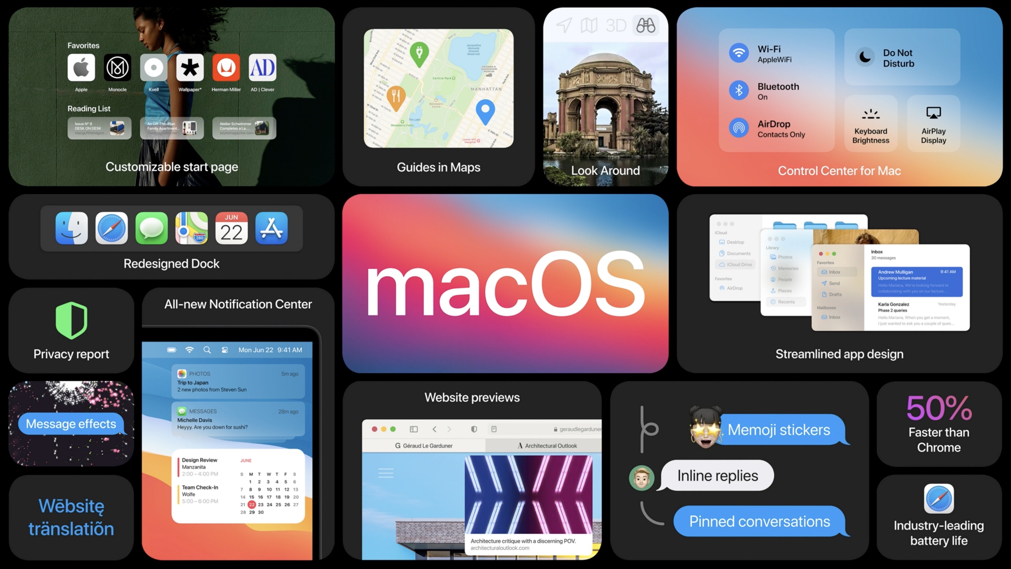
In addition to being Big Sur, this is also macOS 11.0, and that’s a pretty big deal. Apple has been using OSX/macOS 10 for longer than I can remember, and they’ve finally made the transition to the new number. Sure, the operating system looks completely different, but that’s not why they took the jump. In addition to its new software, Apple announced the move to its own ARM processors in the Mac. This is a big, long-awaited change from Apple, and along with its reveal came an approximate two-year timeline until its implementation, all from Tim Apple himself. There’s so much more I could say about this, but to sum it up, poor Intel.
Apple's Unhealthy Obsession
Apple has a very unhealthy obsession with both its Maps and Photos apps. Year after year we see upgrades to them during the keynotes, taking the same amount of time to go through as many of the much more important features being unveiled alongside them. The Photos app is fine. The Maps app has never been and will never be good enough. So just stop, Apple. Just--okay?
In Conclusion
A lot happened at WWDC this year. A lot was great, and some was terrible. But the best part of the keynote was clearly the camera transitions. Go watch it if you don’t know what I’m talking about.
